


Could you build and launch a product that is profitable in 63 days? FeedHive creator Simon Høiberg did exactly that! FeedHive is a scheduling tool for social media. It started with Twitter, being a tool that could only schedule tweets in the future but has rapidly grown both in terms of features and users.
So what's the problem?
Simon, by his own admittance, is not a designer. After all, no one person is expected to be good at every part of website creation, and there are a LOT of different areas to think about! Design, Copywriting, Frontend Development, Backend Development, SEO... The list goes on. So creating a successful product entirely on your own is an incredibly hard challenge.
Simon reached out to me looking for a redesign of the marketing website. The website was fast and built on modern tech (Gatsby), but the design was disconnected from the brand. The website also had no CMS which meant only developers could make content changes - not much of a problem while only developers are working on the website but once the team starts to expand that suddenly becomes a huge pain point.
That design also needed to be adaptable and form the basis of the application design, so that the website and application felt like a singular brand, but also allowing both to expand without having to have direct designer intervention as the product grew.
They needed a flexible design system with strong brand guidelines that could be used for their entire product, created on a platform that they could use without assistance.
What made me the right choice
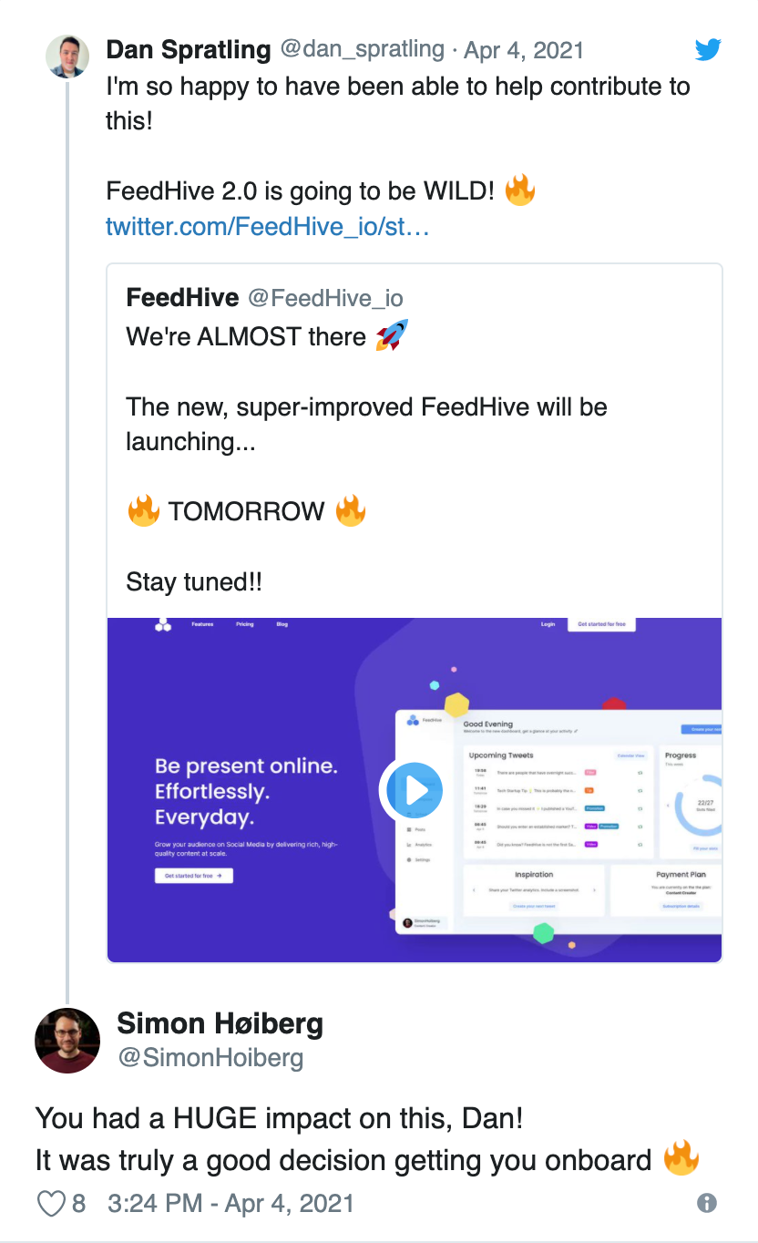
When FeedHive first launched in beta, I was invited to use the product in its early stages. Having insight of the product as it was just starting out meant that I had a great understanding of Simon's vision and the challenges he was running into before working together was even considered.
I had also been growing my freelance business in public since becoming a freelancer in July last year. This meant that Simon had clearly seen not just the websites that I'd made, but the thought process behind them and the human element that went into each of them. As a founder also looking to grow in public, this gave us a mutual appreciation for engaging with our audiences.
I had the UI/UX design expertise sorely missing from the FeedHive team, and also had the development experience to be able to create the marketing website without much interaction, which allowed the FeedHive team to continue making strides in the application while I worked on the new marketing website. Plus with so many aligned philosophies between our businesses, working together made perfect sense, and the results spoke for themselves.
How to sell a SaaS product
The marketing website that was being used for FeedHive was technically functional - it informed you about the application and provided links to it.
In order to get people to return to your website, you have to have a memorable brand.
To get people to sign up for your product, you need to show them the benefits using the product might have.
But if you look at any big-name website you'll notice one thing. They don't stay the same for long. With new product features, experiments and improvements happening all the time a truly great website needs to be iterative. It has to be easy to change quickly.
This was the biggest success of the new FeedHive website. With a strong new brand created, well-defined repeatable code sections, and a CMS set up that allowed easy content updates the new website was in the perfect position to be changed quickly. And that's exactly what happened, with experiments constantly running to test and improve upon the different sections and new components being built as the brand changes.
Managing customer expectations
FeedHive is now live and no longer in beta, but it is still relatively new. The team have a lot of goals they want to achieve but when the new website launched, FeedHive was still twitter exclusive. This meant that we needed to be careful how we sold the product.
Selling FeedHive as an "All in one social media scheduling tool" is tricky, as even though that's what it will eventually become it's not quite there yet and we don't want to trick customers into thinking that it's more than it is.
Another challenge was adjusting the price from $5 per month to $9 per month.
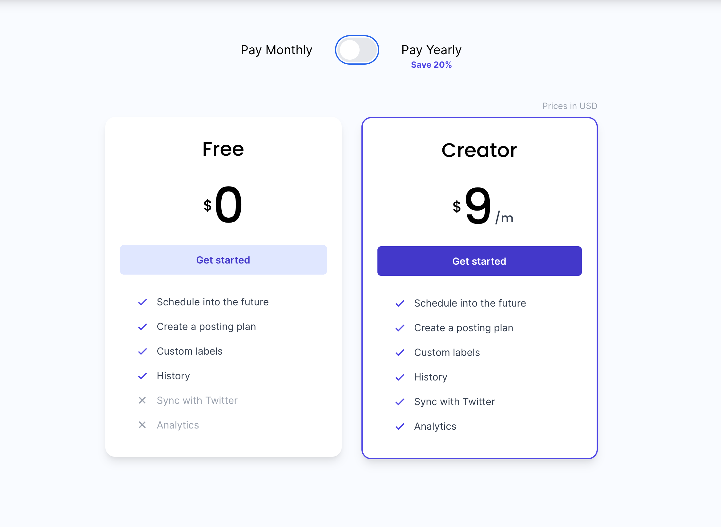 The new pricing page for FeedHive with the Free and Creator tiers with the updated pricing models
With a significant amount of new features added and a complete overhaul of the application including adding a new dashboard the price increase was justifed, but increasing the price on any product is always going to be tough for users to swallow so it was important to show them exactly what the benefits of the application was.
Users had to feel like the product was more premium and enhancing the product branding definitely helped give the feeling of a higher quality product ready for public use.
Leaving room for growth
As with any online product, you do not want to be restricted by your technologies as you grow. There are a lot of things you need to consider:
- How your entire team might use your website
- How developers might want to make changes in the future
Setting good standards for the entire team to use going forwards is incredibly important at the early stages of a business and something often overlooked, leading to more time (and money) being spent further down the line when the issues become too big to ignore.
The FeedHive team have since added new components that have not been created by a designer, but are still on brand for the product.
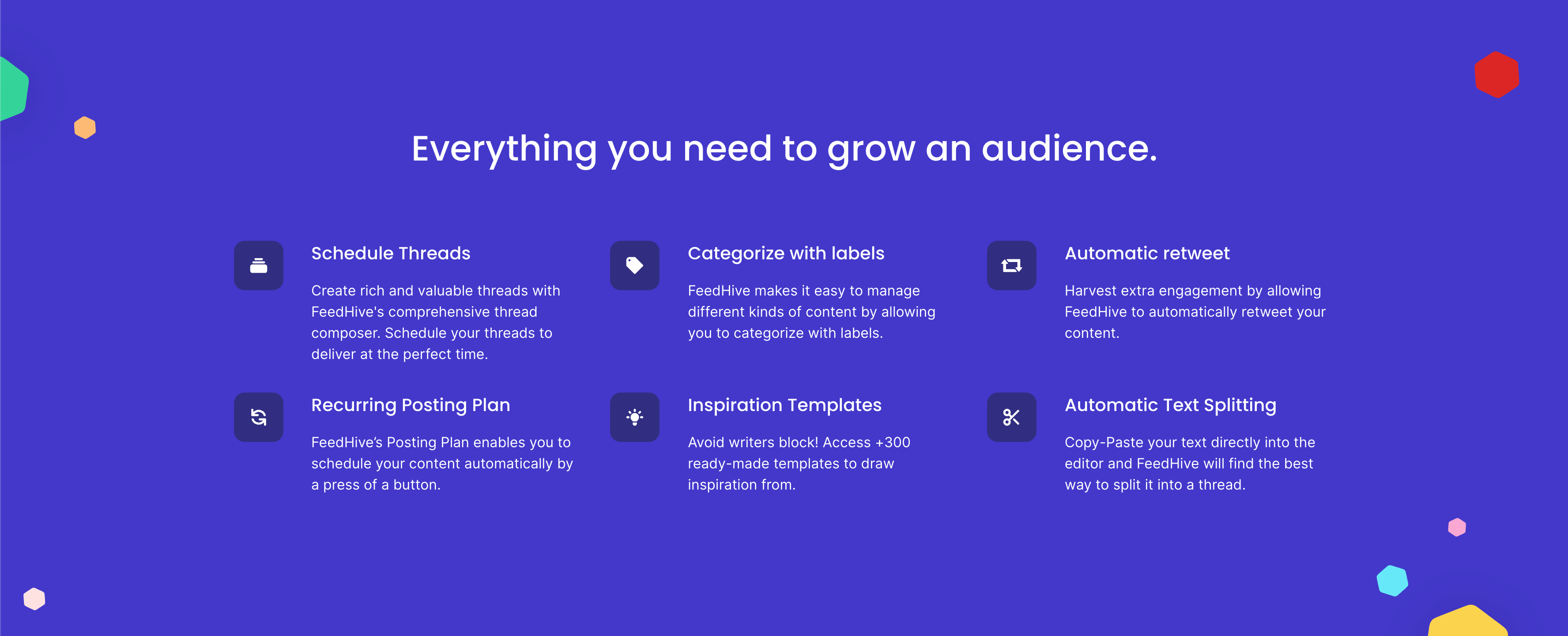 A new feature component created by the FeedHive team without any design input
Along with these changes to the marketing site, the application has also had substantial design changes but still remains on brand.
 A new application screen with completely custom components taking on the brand guidelines set up by our dashboard revisions
These changes mean 2 things
- The design system was clearly set up and easy to understand and add to
- The code was clearly set up and easy to make additions to
If a team can take on board designs and code and run with them, making them their own and adapting and improving them for their purposes then that's a huge success.
Being able to immediately expand code and add in custom designs is important, but so is giving the team ability to grow. The marketing site is built on top of Prismic, which is a CMS designed for quickly editing content. That means it's perfect for writing blog posts to capture SEO value and easily making changes without requiring changes to the code.
That's perfect for making changes fast, but it's even better considering the team will be likely to grow in the near future, meaning that costly development effort doesn't need to be spent making content changes and can instead be focused on more important areas, like improving the application.
No app left behind
Even though the main focus of my work was to redesign and rebuild the marketing website, I also contributed to the app. It was important to get a consistent brand shared between the two products and set FeedHive up with the ability to take a core design and run with it.
These changes took the form of designing a new dashboard, something that was sorely missed from the initial implementation of the app.
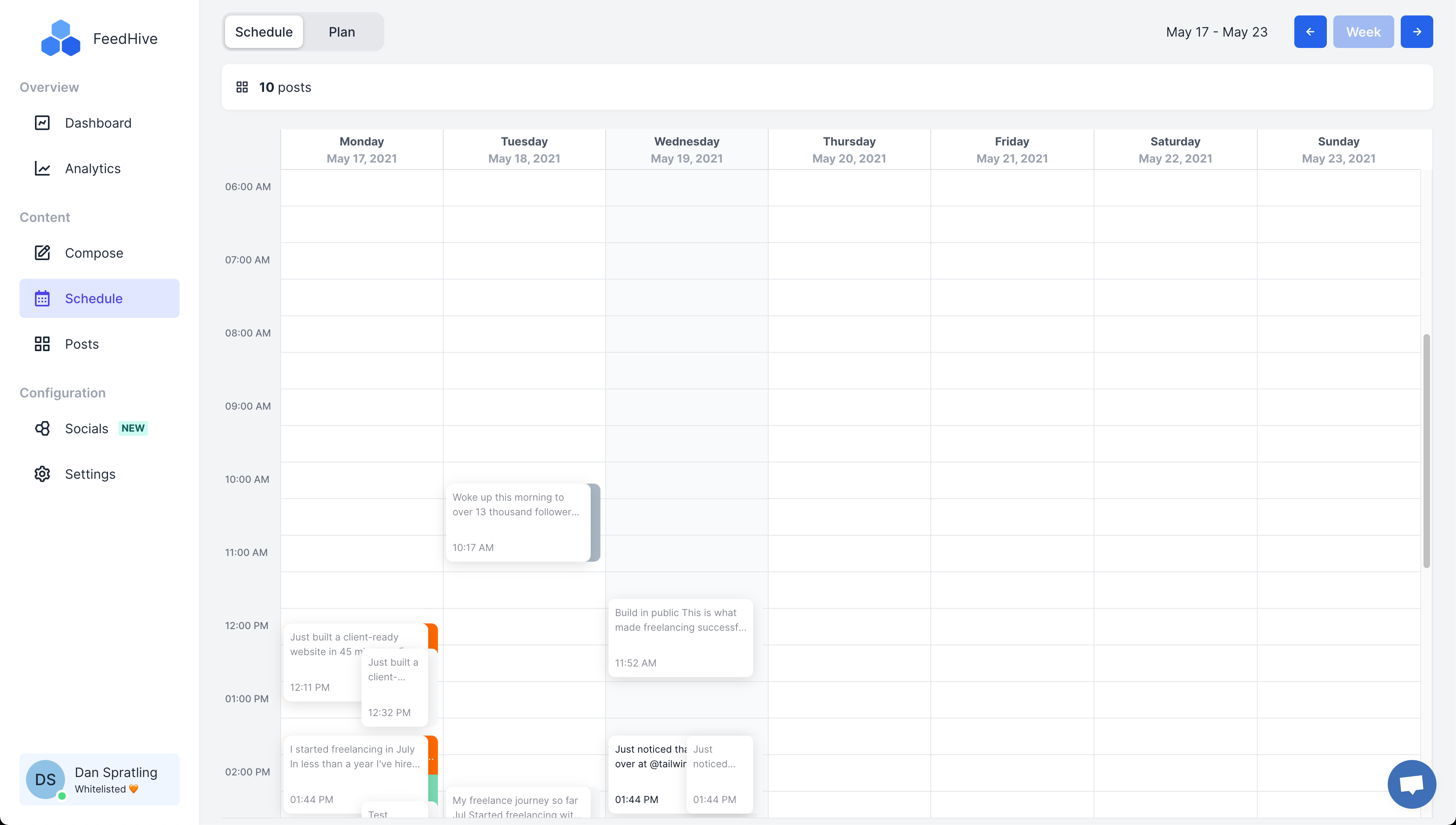
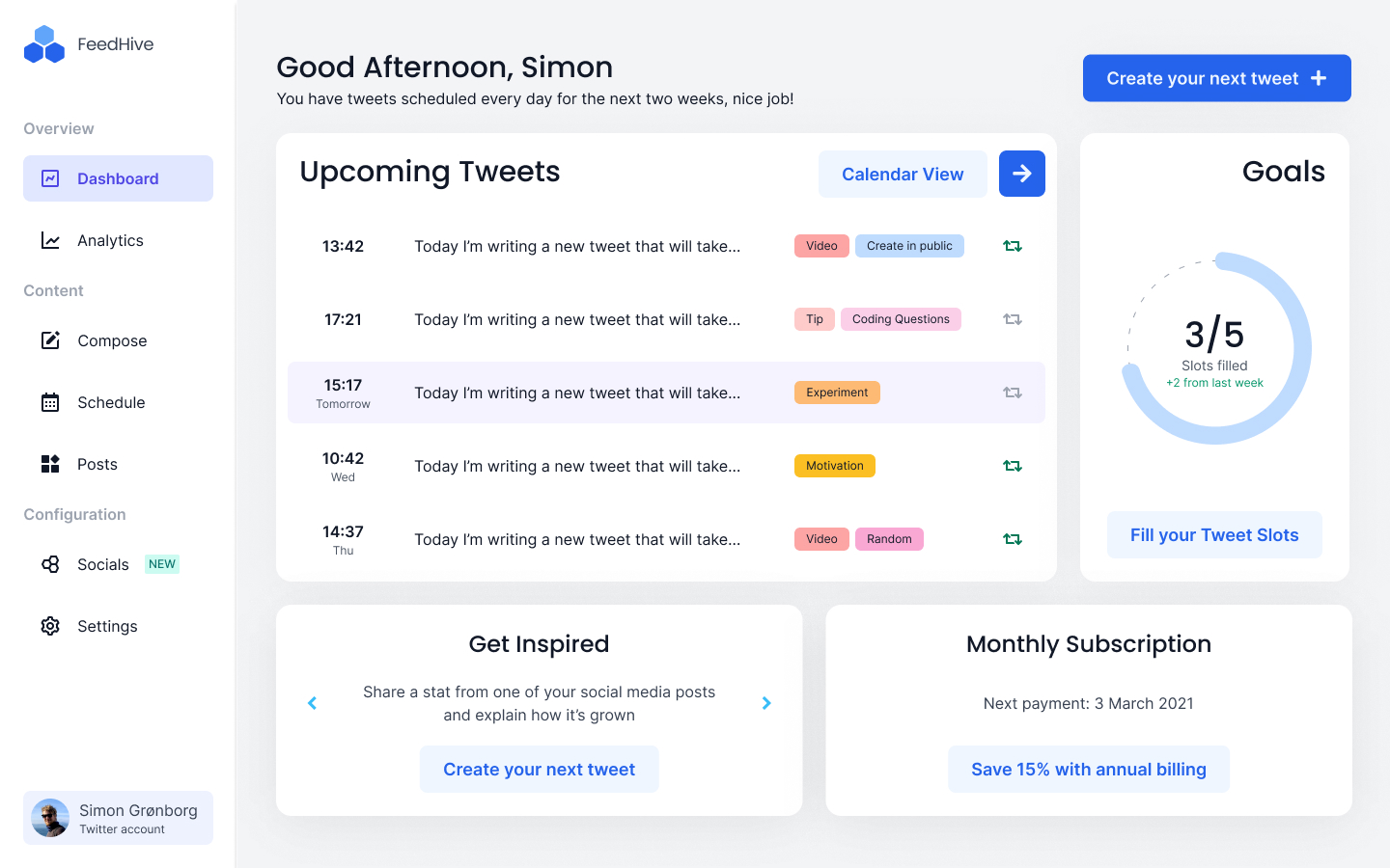 The new dashboard design created to help implement strong fundamentals for FeedHive's application
As I was on a strict budget for this line of work, I had to create a strong set of fundamentals that could be reused across the application easily and significantly improve the application as a whole.
And it worked! The team have taken the core of this design and run with it, updating old concepts to match the new branding on pages like in the schedule, and creating entirely new custom designs while still matching the core fundamentals like the analytics screen.
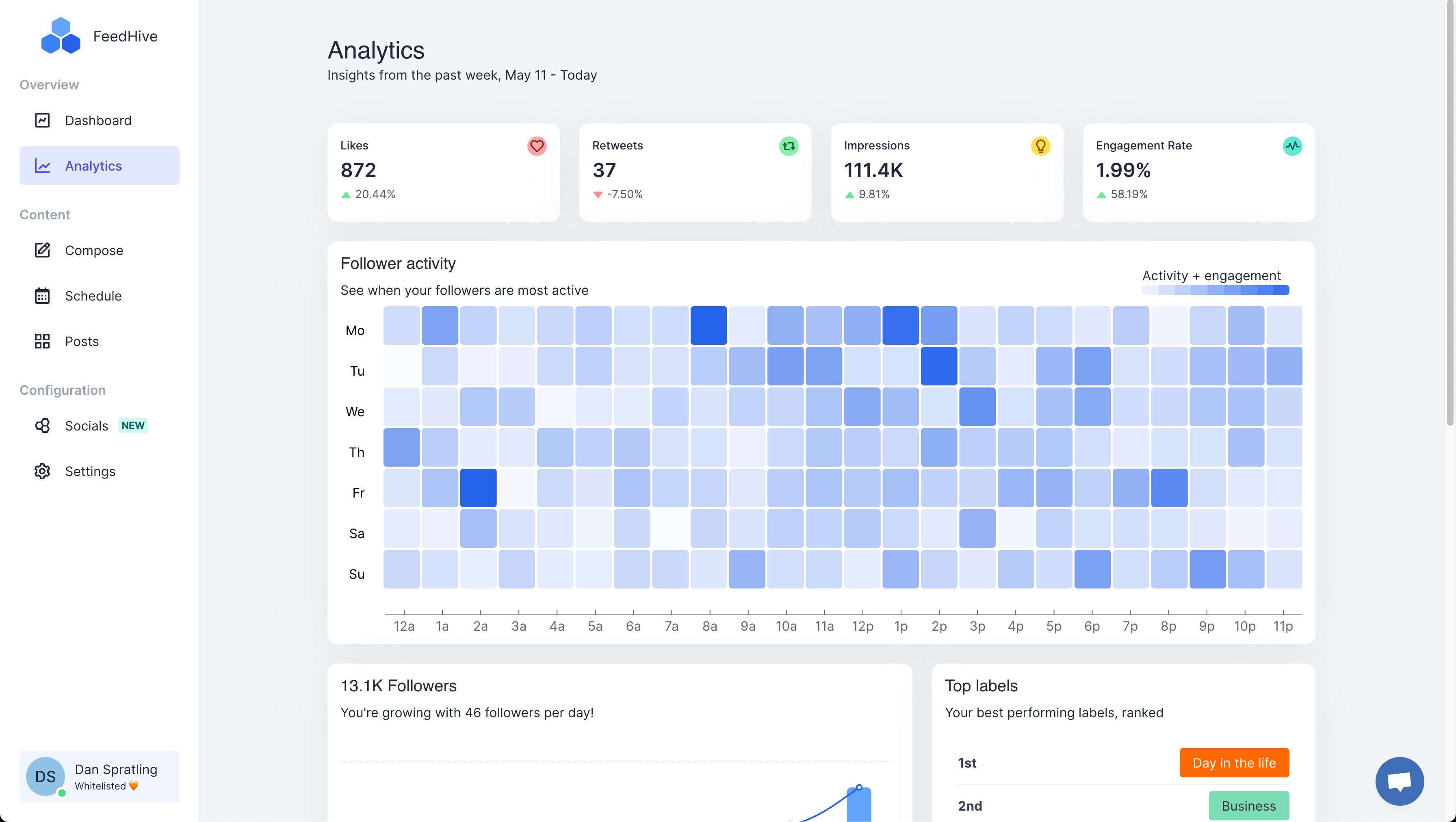 The new analytics screen which was built without any input from me but still provides a consistent branded design and clearly displays important information.
The results
The changes to FeedHive have been a huge success, giving the FeedHive team a strong starting point that they've taken full advantage of. Being able to adapt their website on the fly to make the most of the data they were already receiving while having an welcoming new design for the application that they could easily expand upon meant that changes happened faster and improvements came quicker.
It wasn't just a success internally either. Their audience loved the new look.
What the FeedHive team were left with, then, was a marketing website that worked exactly how they needed it to. It may not have immediately converted more leads, but what it did do was give them the ability to test and improve conversion rates themselves and continue easily making improvements to the website and application with a strong foundation to go from.

