10 ways to improve your site accessibility


Stop settling for lackluster accessibility. Make your sites available to everyone and gain more views.

Dan Spratling
May 14, 2020
4 min read
A lot of people miss the mark when it comes to creating accessible webites, but improving accessibility is often just about creating some good habits when you code. I've made a list of things I always do to make my sites more accessible.
1. Semantic HTML
ALWAYS use semantic HTML. Semantic HTML makes screenreaders and users understand the intention behind your code without you having to make any additional changes. Always come with the correct interactions too so this means you have less work.
<!-- bad -->
<div class="button">Submit</div>

<!-- good -->
<button>Submit</button>
<input type="submit">Submit</input>2. Content structure
Don't break content up in unnatural ways. The content should make sense in HTML order as well as visually so that it makes sense when being read by screen readers. Sometimes something which makes sense visually, doesn't make sense to a screen reader.
<!-- bad -->
<h1>Page heading</h1>
<h3>Page subheading</h3>

<!-- good -->
<h1>Page heading</h1>
<h2 class="font-size-h3">Page Subh</p>
3. Navigating with Tab
For keyboard users to be able to navigate content, they have to tab through the page. You should regularly tab through your pages to check that all clickable elements can be accessed with the tab key too. Using semantic html will help here.
4. Keyboard accessible content
Anything which you can click you should also be able to interact with using the keyboard (often by pressing enter). If you have a form on your site, you should be able to submit it by pressing enter. If you've created any javascript events which happen on click, they should also happen when you press enter.
5. Navigation
If your page has unexpected navigation actions, your users might get confused or even lost entirely. External links which don't open in a new tab can make the user lose track of where they were. If you're maniuplating your user's route, back should act logically. For example filtered lists should take you back to the last selected filter, not the last page you were on.
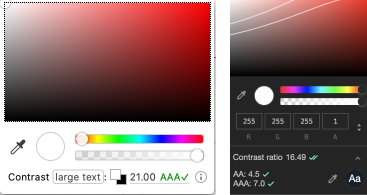
6. Colour contrast
Always check colour contrast on text. Aim for AAA if possible. Browsers now come with a contrast checker built into the element inspector so it's especially easy to tell if your content is readable for everyone.
7. Alt tags
Images are a visual only medium, so you need to make sure that they have descriptive alt text if they're critical for your content. Images are useless if they contain important information but can't be seen by some of your users.
8. Properly name links
Similar to alt tags, links need to have descriptive text to be accessible. Links can be jumped to from anywhere in the page, so should make sense without the context of content around them.
9. Checking accessibility with Lighthouse
Lighthouse allows you to check your site's accessibility, along with a few other important criteria. It's not a perfect test, but it will bring up a lot of the basics if they've been missed. It's an excellent way of quickly checking through any issues.
10. Accessibility plugins
Another easy way to check accessibility is to build it into your workflow. You can get some excellent plugins which do similar checks to lighthouse, but during your build so it's even harder to forget. Again, this approach can't be perfect but is really helpful for keeping track of the basics.
React eslint accessibility pluginVue eslint accessibility plugin
Creating accessible websites is something we often forget to think about, but it's not hard. It's all about building good habits, and using the tools we have at our disposal. Start building good habits and make your site better for all yone!
Tags:
Accessibility